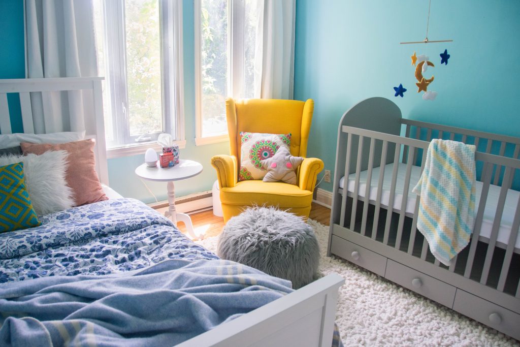
I know not everyone wants or needs or has room for a baby nursery in their home, but for us, we really wanted the baby to have their own room. And we bought the house with the idea of potentially using it for an expanding family someday, so we obviously picked a house that had extra rooms and space for kids. We ended up designating the guest bedroom as the nursery and I think it turned out pretty well!
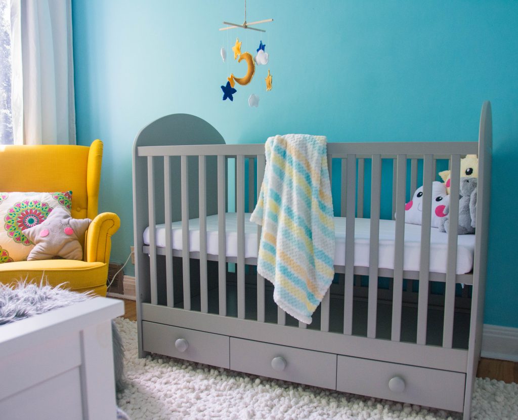
And before you come at me with your pitchforks, let me assure everyone that I have art directed the nursery specifically for this blog post. The room has been styled for photos and also ’cause I think it looks cute this way while it’s not in use. This is not exactly what it will look like when the baby is using it. Rest assured, I have done a lot of research and I ain’t no dummy!
If you’re familiar with the old guest bedroom design, (full post here) you may have noticed that I did not repaint the walls for the nursery. For one thing, I really didn’t want to go to the trouble, but also, I really love the sky blue colour and think it would work great in a kid’s room.
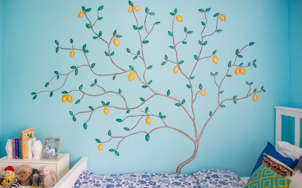
I opted instead to do a statement wall with a mural of a lemon tree, inspired by this amazing Dina Bandman design. I just love the vintage look of the art style. It’s a little whimsical without being too childish or cartoony, and if you’ve been following me for a while, you know I love lemons! The full how-to blog post is here if you want to read more about it!
And so, it was from that tree design idea, and in keeping as much of the original room as possible, that I decided on a colour palette of mostly blues, whites and yellows. And you know me, I always introduce little pops of colour in my designs, but the grey was kind of an accident because the store where we got the changing pad I wanted just had it in grey. I just went with it!
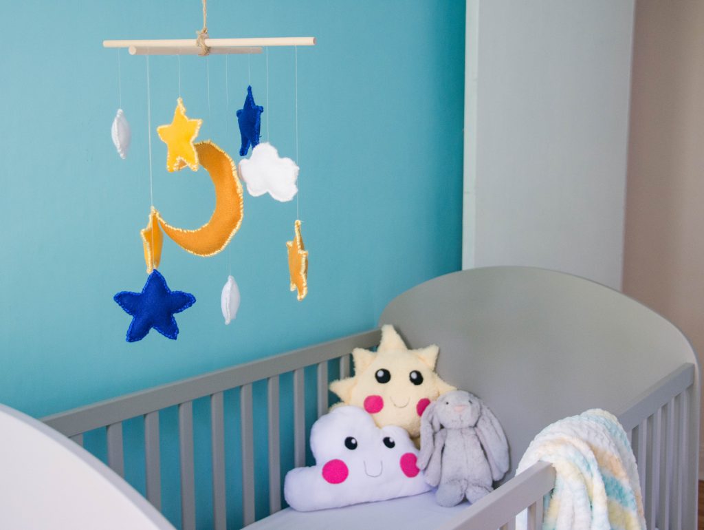
Before you knew it, we ended up with a grey crib, I painted the old guest bedroom side table grey and I had thrown in little pops of grey everywhere! It’s never a bad idea to introduce neutral colours into a colourful design. It really gives the eye an opportunity to rest and I think it works really well with the other colours.
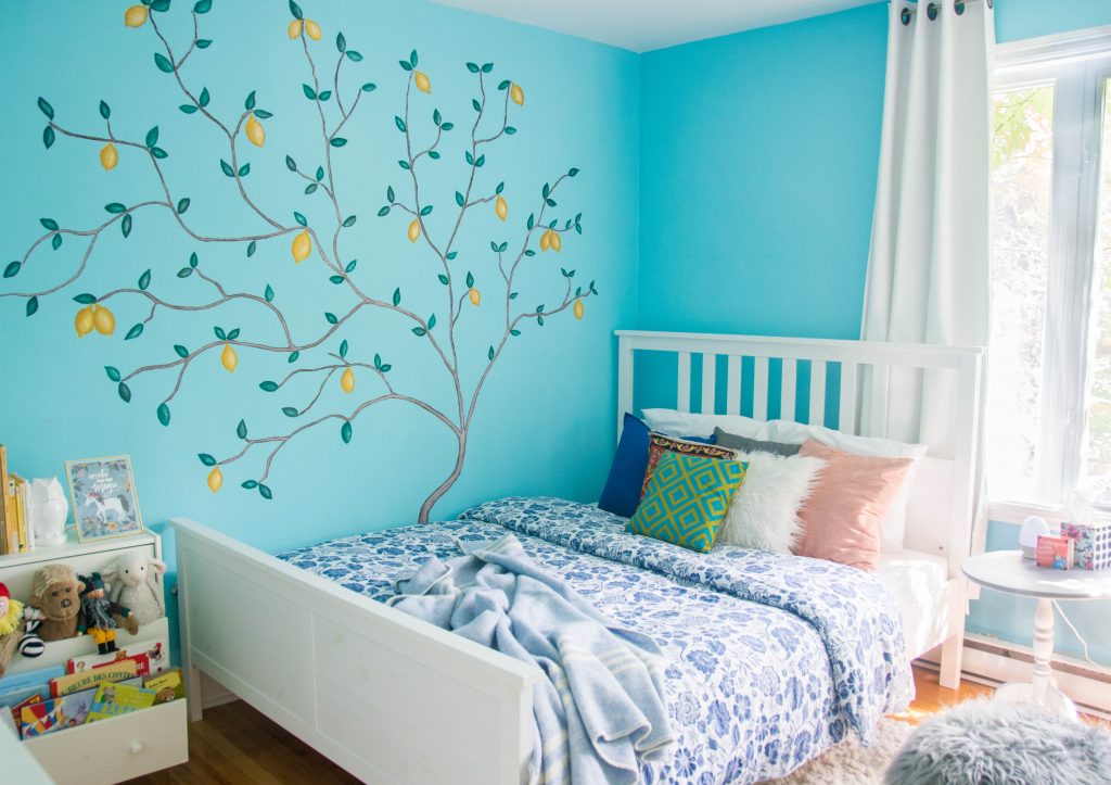
Speaking of keeping as much of the original room as possible, I opted to keep the existing queen-sized bed in the new nursery, in case either Kyler or I or both of us want to sleep with the baby. I think it’s best for us to be flexible with sleeping arrangements, since we don’t really know yet what will work for us. Also, it was such a pain to assemble the bed, I am not interested in disassembling it if I don’t have to!
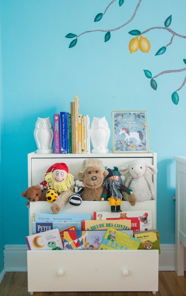
I’ve also kept the original mini Ikea dresser we had in the guest room as a kind of toy and book storage solution. I think a lot of people will feel me on this, but I did not want to spend a lot of money on new things that are too baby-specific. It’s just more to get rid of later! I wanted the few pieces we invested in to grow with them.
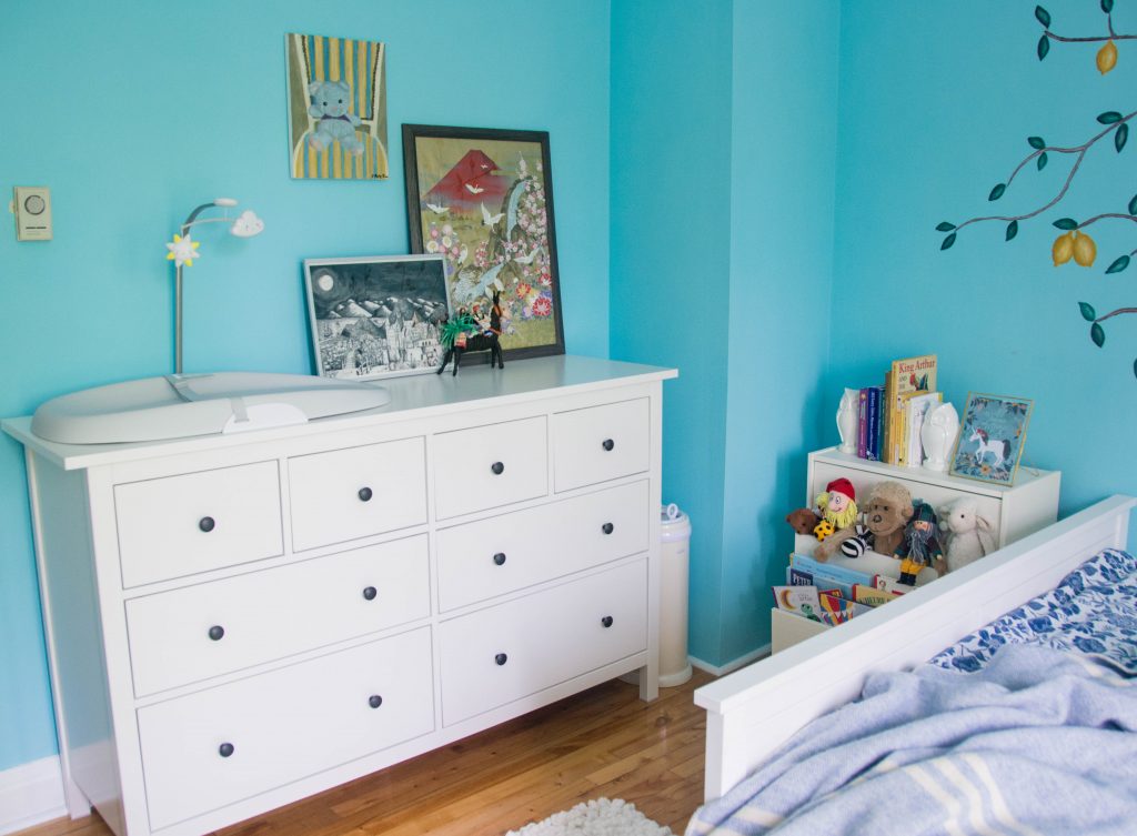
So for example, we opted not to get a changing table, but a large dresser that can support a changing pad instead. That way, they can use the dresser well into their teens and we only need to get rid of the pad once they’re out of diapers. A huge dresser is also important to have in our room in particular because it doesn’t have a closet.
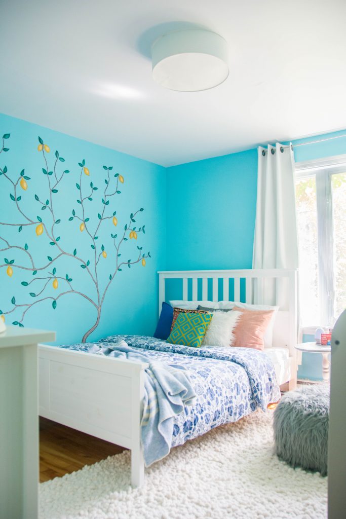
Same for the rug. I toyed with the idea of getting them a fun, interactive/cute rug. I’m sure you’ve seen them. They’re bright and colourful with roads and trees and all sorts of fun things in the design, but I thought about it more practically and decided it was better for us to get a rug they could grow with as well. I still opted to make one that’s really fluffy and textured that a baby might find interesting, but I figured, simpler is better. You can find the full DIY post here, in case you’re interested in making one!
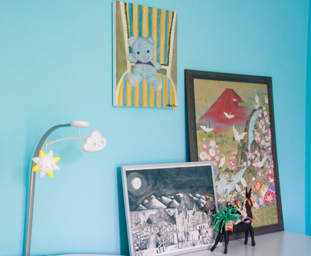
The only super “baby-specific” things we ended up getting were the change pad, diaper pail, and crib. The armchair, the decorative cushions, the side table, the curtains, the light fixture, the floor pouf, the prints, the painting, even most of the toys were stuff we already had in the house or the guest bedroom itself.
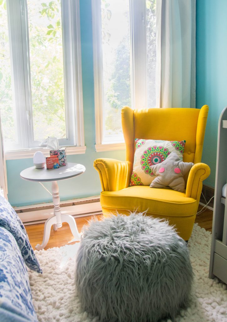
Overall, I’m super happy with how the nursery turned out. It’s functional, but has its cute moments. And let’s be honest, babies don’t care about decor and what colour the room is… Nursery design is for the parents and, like every time I approach creating a design in the house, I really made it about feeling good, enjoying my space and creating a visual feast to experience.
bed – Ikea
bedding – Ikea (old)
blue throw blanket & white/blue/yellow baby blanket & owl bookends – gifts
bear painting – DIY
large dresser – Ikea
changing pad – Skip Hop
diaper pail – Ubbi
crib – Ikea
armchair – Ikea
floor pouf – Urban Planet (old)
throw pillows – Homesense, Ikea, from Greece (all old)
prints – from New Zealand, from Japan
side table & people riding horse figure – thrifted
small dresser – Ikea
old man wooden doll – from Czech Republic
log driver doll – NFB
giraffe rattle – Ikea
zebra toy – Ikea
monkey, bear – old
bunny – Jellycat
mobile – DIY
rug – DIY
light fixture – Ikea
curtains – can’t remember
table light – Amazon
xoxo

