Hi. It’s me. I’m still here! It’s been pretty hectic at our house the past few months. New baby, renovations, designing, sourcing/procuring furniture and fixtures, doctor’s appointments, vaccines, going on a family vacation for the first time in three years, getting ready for Halloween…
I thought I’d have more time in November to catch up on some things I had put on the back burner, but it’s actually shaping up to be a bit of a busy month as well. Nevertheless, I’ve been taking some photos, editing them slowly, and trying to get back into things besides childcare and vacuuming the floor (why is there always IMMEDIATELY a huge mess again right after I clean??)
Our huge extension project is finally winding down, with the final stages set to start next month, ie. the basement bathroom/laundry room still needs to get done. But I think I’ve more or less finished the powder room so I’m finally going to start revealing the fruits of all these many months of labour!
Go Bold Or Go Home
I’ve said it a million times, and I’ll say it again: the perfect place to take design risks is in a powder room. It’s likely the smallest room in your house, so it’s not so in your face. And everyone has to have all the same standard, practical furniture in it, so why not jazz them up a bit? Going bold on the walls, adding an interesting light fixture, mixing styles, going for bright colours, the possibilities are quite plentiful for such a small space.
Our powder room is actually a tiny closed-off section of our new main floor sunroom. And when I say tiny, I mean like 6 feet by 3 feet. Like the smallest possible powder room that’s legally allowed in a residence.
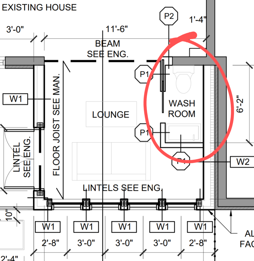
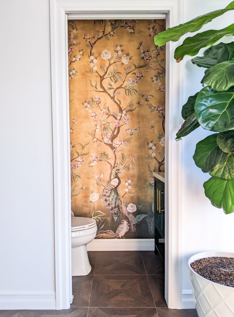
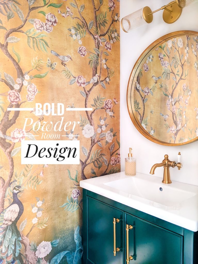
When it came time to start designing the interior, I knew immediately I wanted chinoiserie wallpaper in there. It’s colourful, vintage-y, it’s got those nature vibes…I just love it!
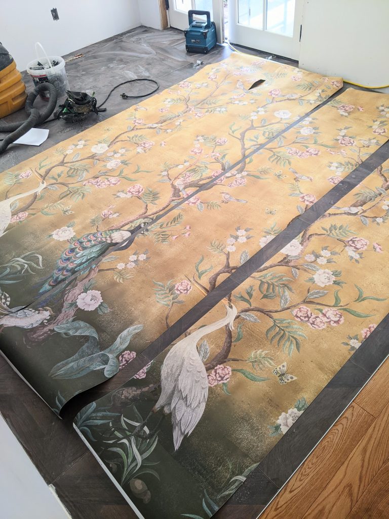
I couldn’t decide if I wanted the whole room in wallpaper or just an accent wall. I hesitated a lot because I know wallpaper, and especially chinoiserie, is such a choice. If we ever wanted to sell the house, it could potentially be so off-putting to some people that we wouldn’t be able to sell it. Especially if it went behind the toilet and vanity, which would be such a pain to remove!
But then I wasn’t sure if a feature wall would look strange or not when it wasn’t going to be on the vanity wall, nor the toilet wall. In the end I went with the accent wall and I think it turned out so well!
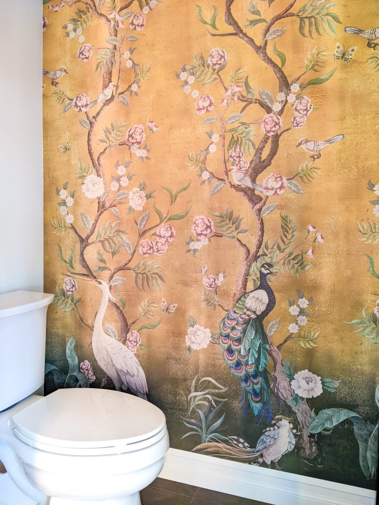
It’s just peel and stick rather than traditional pasted on wallpaper, so it’s easy to remove and change out if I (or future homeowners) ever want to change it. I’ve linked the wallpaper below and would highly recommend the seller if you’re in the market for interesting wallpaper. I asked for a somewhat custom order and they were a real pleasure to work with!
My New Favourite Colour In Design
Move over teal, Mama’s got a new go-to design colour! Don’t get me wrong, teal holds a special place in my heart, but a few years ago, hunter green started creeping its way into my wardrobe and now it’s all I wanna add to my new designs.
I think I just love the subtle drama of such a colour. It’s rich, but not too deep. Eye-catching, but not too bold. It makes a statement, but in a quiet kind of way. And if you ask me, greens and blues are practically neutrals. They go with everything!
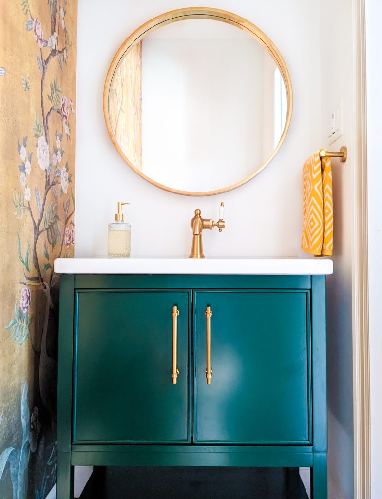
When I saw this vanity, I just knew it was the one. The colour is so striking. The design is simple but classy. The hardware has just a touch of vintage interest. It even checked all the practical boxes of having closed storage, plus an open shelf.
And this is a total aside that is probably relevant to no one except us, but the extra wide counter space for such a small vanity is really helpful for putting the hand soap within reach of a toddler.
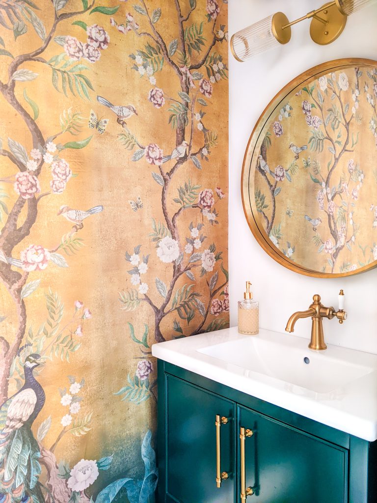
Isn’t the vanity with the wallpaper a match made in heaven? They’re such lovely pieces on their own, but together, they just sing!
Finishing Touches
Once the vanity and wallpaper were chosen, everything else kind of just fell into place. We always knew we were going to continue the flooring from the sunroom to the powder room. Not only was it simpler, but visually, I think it made the most sense.
When it came to the faucet, I toyed with the idea of going more modern (I know, very unlike me!) but in the end, I decided to go with the same vintage style that I had chosen for the upstairs bathroom and the kitchen. The funny thing about this faucet I chose was it came with a shattered piece of ceramic on the side, which I was willing to fix to keep the faucet, but then when the plumber installed it, the vertical handle just snapped completely off!
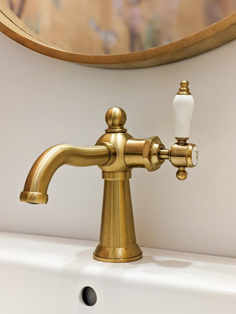
We had a hell of a time trying to get the company to send us the handle part we needed to fix it, but for some reason they wouldn’t sell it to us. We ended up just picking another handle that was close enough and it just needed a different type of screw to fit into the faucet. I think it worked out well, and honestly, the shattered ceramic doesn’t even bother me. You hardly notice it!
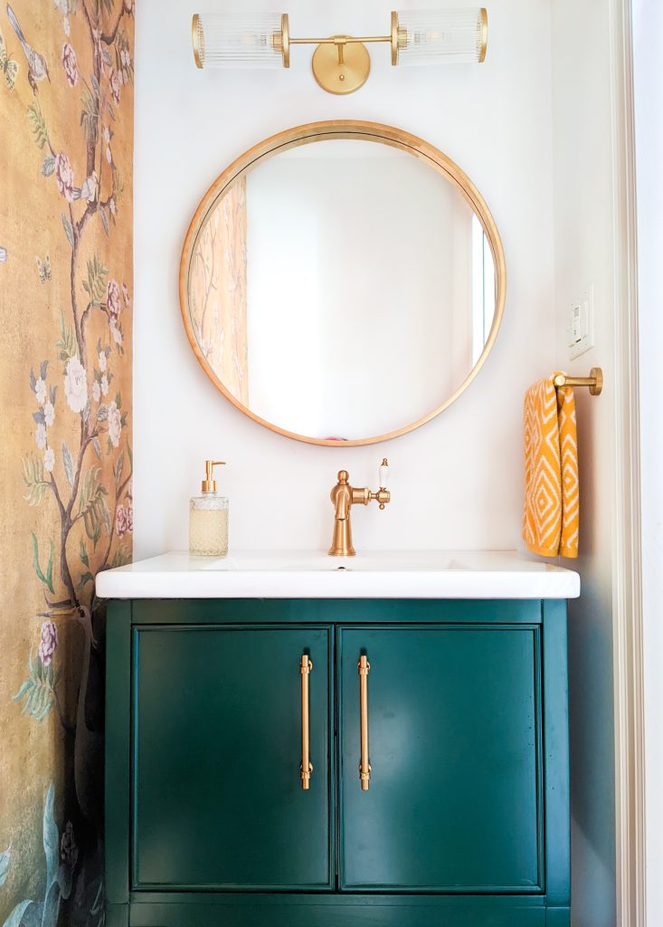
When it came to the mirror, Kyler pushed for a circular mirror from the beginning, but I was very resistant due to my “more is more” attitude towards this design. I thought a round mirror would be way too boring! I wanted a more intricate piece.
Over time, I began to see the merits of a simple mirror, especially since I really wanted the wallpaper and vanity to be the focal points of the room. But when it came to searching for a simple, round, gold mirror, I was surprised at how expensive they actually were. As I said, the wallpaper and vanity were the stars of the show and their fee reflected that! I didn’t want to pay an arm and a leg for everything else. So we ended up just buying a $60 Homesense mirror in the wrong colour and I spray painted it gold. I think it turned out quite well!
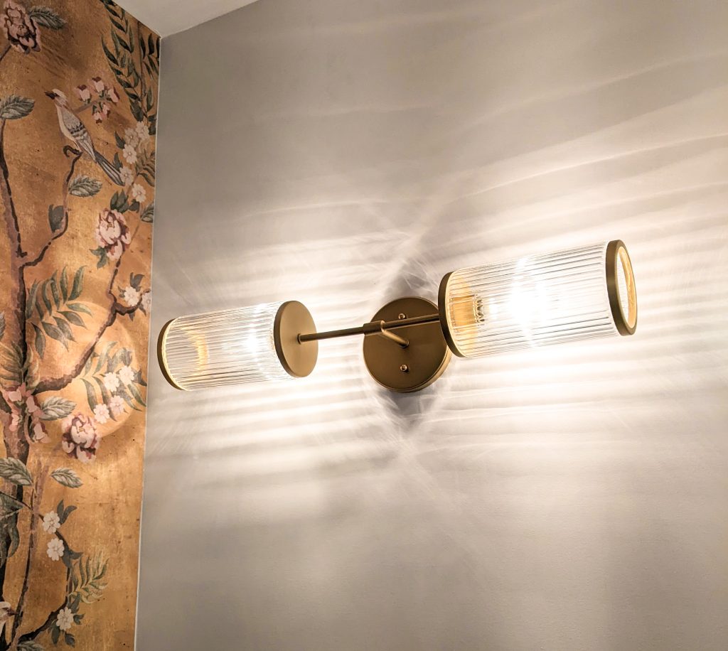
And finally, the light fixture was a surprise find that actually goes way out of my design comfort zone. But again…that’s what powder rooms are for! Design experimentation!
I say it’s a surprise because I found it at Home Depot for around $100. And this kind of light is not typically what I go for, but 1) I feel like it has a bit of an art deco vibe, which works well with keeping in the vintage themes of the room and the house as a whole, and 2) I just love the patterns the light makes on the walls!
Because the room has no windows, this is the only light you get and I think it’s actually quite beautiful to look at.

Speaking of no window, it was incredibly hard to take photos of this room and edit them! Not only was there practically no place to stand to get good angles, but the only light I could get was from the doorway. Usually when the lighting is really bad, I’ll set up some photography lights, but there was no way they were fitting in this tiny space.
But you do what you can! I think you get the idea.
And shoutout to our contractor (Tecto Renovations) who did the flooring and, well, built the whole room from nothing!
Wallpaper – Etsy
Vanity – Wayfair
Faucet – Wayfair
Tile – La Tuilerie
Mirror – Homesense
Light fixture – Home Depot
P.S. some of you may remember this is the room where I hid a little time capsule in the wall. If you’re reading this in the future and you own our house now, let me know if you find it!
xoxo

What size towel bar & towel did you use?