When we had moved into our 3-bedroom house about six years ago, I had no problem claiming the third bedroom as my office. Given that I had a work-from-home job, and I needed space for all of my crafting and DIYing, it just made sense!
Over the years, the room has seen some minor transformations, namely in the different furniture department, and most recently, it has been the home base for my grow-op in the winter/early spring months, and a dumping ground for all of Theo’s excess books and toys.
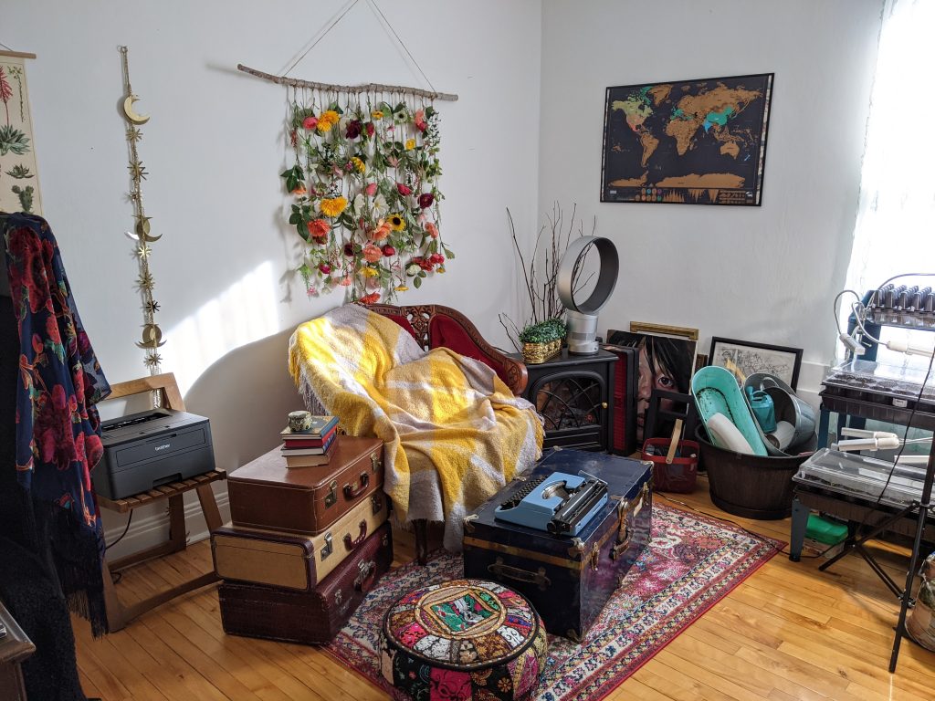
Needless to say, when I became pregnant last year and we really started planning for our home extension project, it was obvious that this room should become the new baby’s room and my stuff would get moved into the new space.
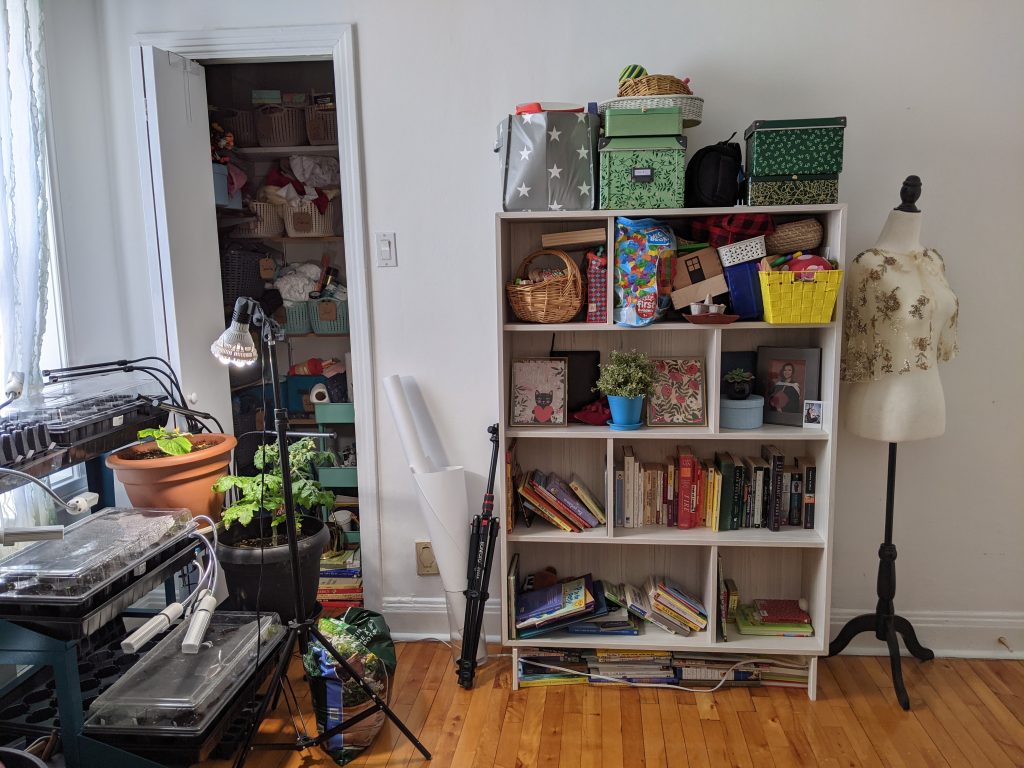
Unfortunately, the timing of the extension was not very conducive to “preparing” the baby’s room in a timely manner. I needed an office space until I went on maternity leave and there was literally not a single spare square foot to be had in the house where I could put my desk.
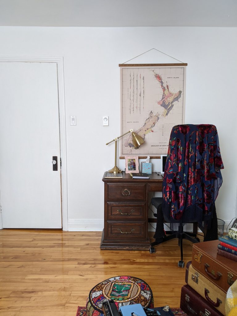
Finally at the end of May, I decided to go on maternity leave a whole month earlier than I had planned and since I didn’t have to work anymore, we kind of just put as much office stuff into the hallway and our bedroom as we could, and actually started preparing the baby’s room!
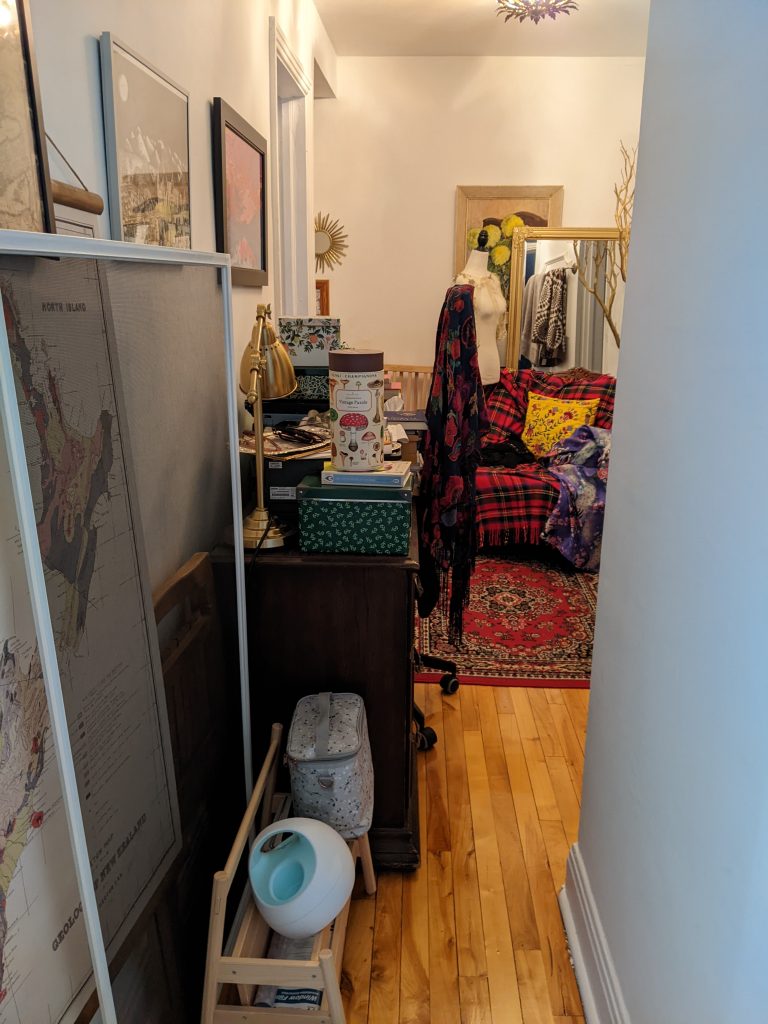
I guess you could say, the lack of space we are currently experiencing inadvertently steered my design choices for the nursery to the more minimalist side, which let’s be honest, is very unlike me! I am a maximalist at heart. But still, I am not a fan of clutter or things that serve no purpose. To be clear, I believe being beautiful is a very valid purpose!
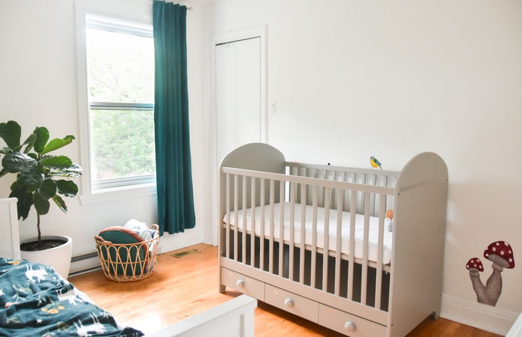
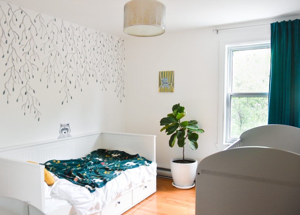
I should back up for a second and mention the willow tree mural I painted. I did a whole blog post about it, which you can read about here. But essentially, I based my nursery design on that, along with the fact that the room is not that big, and the closet, window and forced air vent would limit where we could put large pieces of furniture.
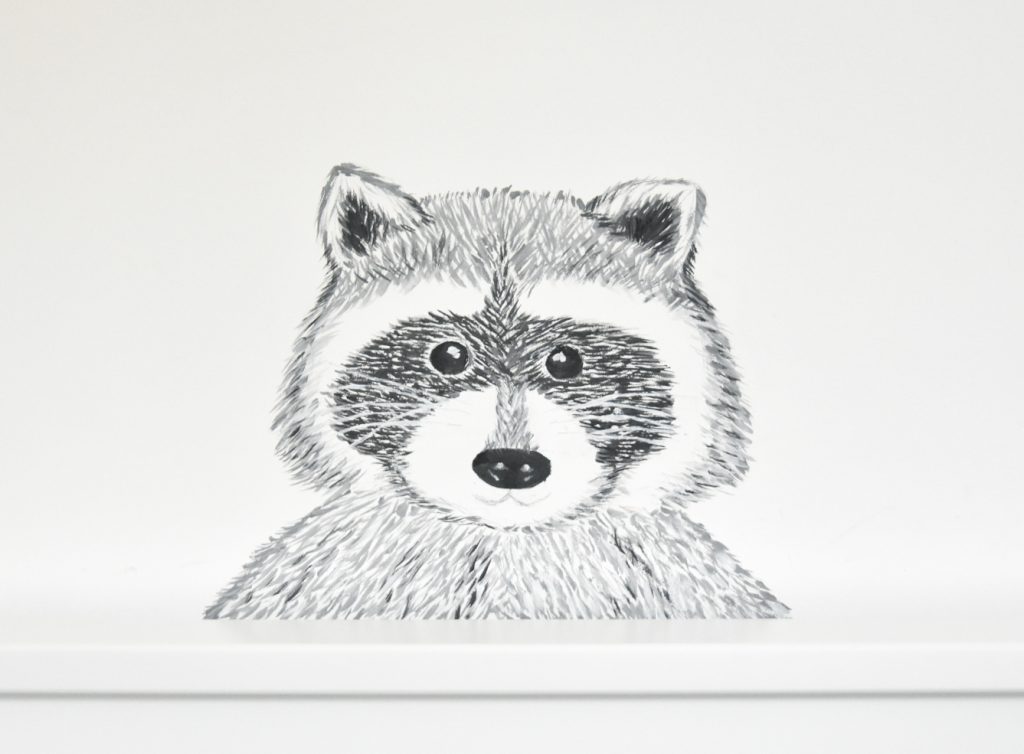
One of the later additions to the nursery design was this little raccoon peeking out from the daybed. It wasn’t part of the original mural design I had sketched out, but I just had the idea later on and thought it was too fun not to try.
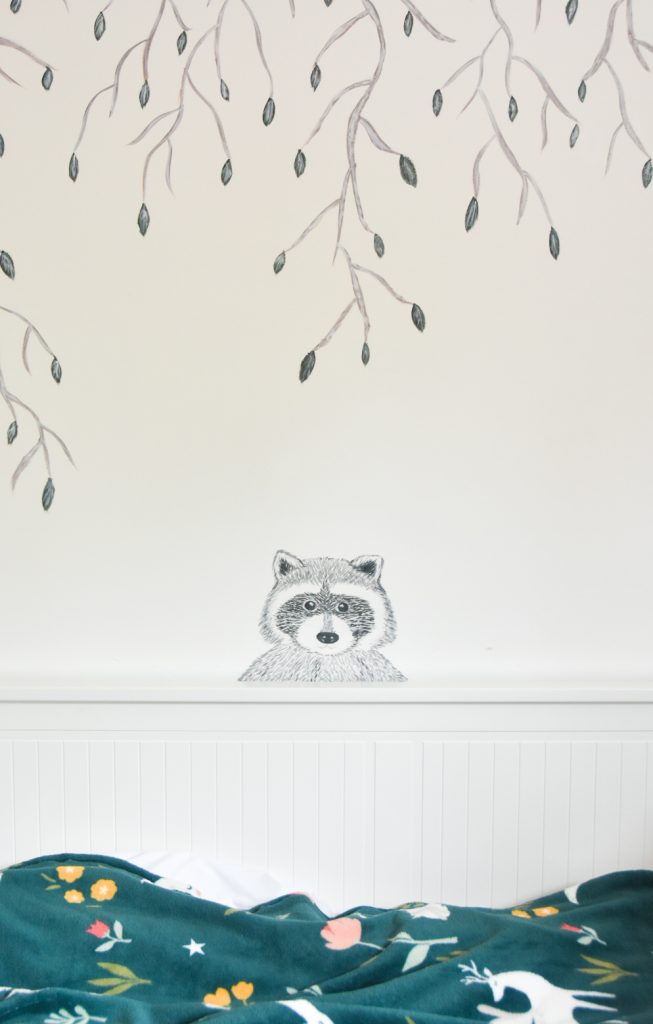
Although, I did have a passing thought that maybe it’s creepy to have something poking out from behind a bed to stare at you while you sleep?! Also, I feel like the facial proportions read more like a bear than a raccoon, but meh. I can’t be a perfectionist about everything. Sometimes you just gotta let things go!
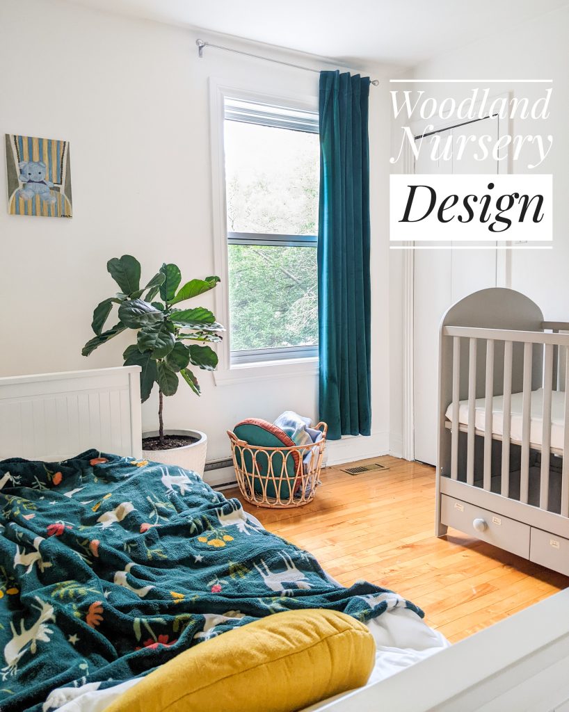
One of the only new pieces of furniture we got was this daybed from Ikea which we actually got months ago and didn’t get around to building until mid-June, once I could clear my stuff out of the room, and went on maternity leave. You know, when I was free to actually work on our huge house to-do list.
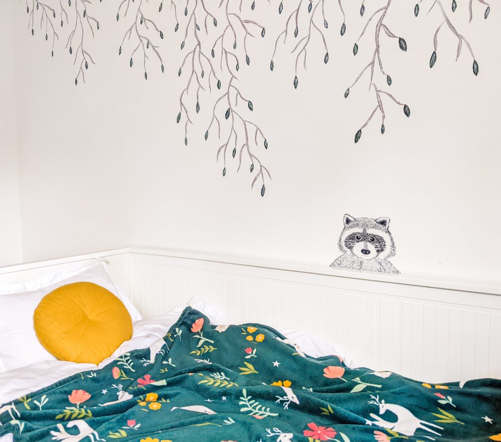
It’s essential for us to have a real bed into this room because of how we’re handling night shifts. We had a queen bed in Theo’s room when he was a baby, and I would essentially sleep from 9:00 to 3:00/4:00 in our room while Kyler slept in Theo’s room and was “on call” for that time. Then we’d switch rooms for the rest of the morning and I’d be on call. This ensured that we could both get a good stretch of uninterrupted sleep!
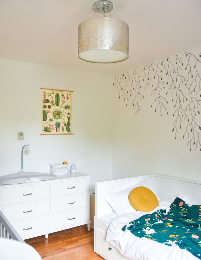
And because it’s a daybed, it serves our immediate needs, but it can also turn into a toddler bed and a full-sized king bed once you pull it open. I can see this bed lasting us years!
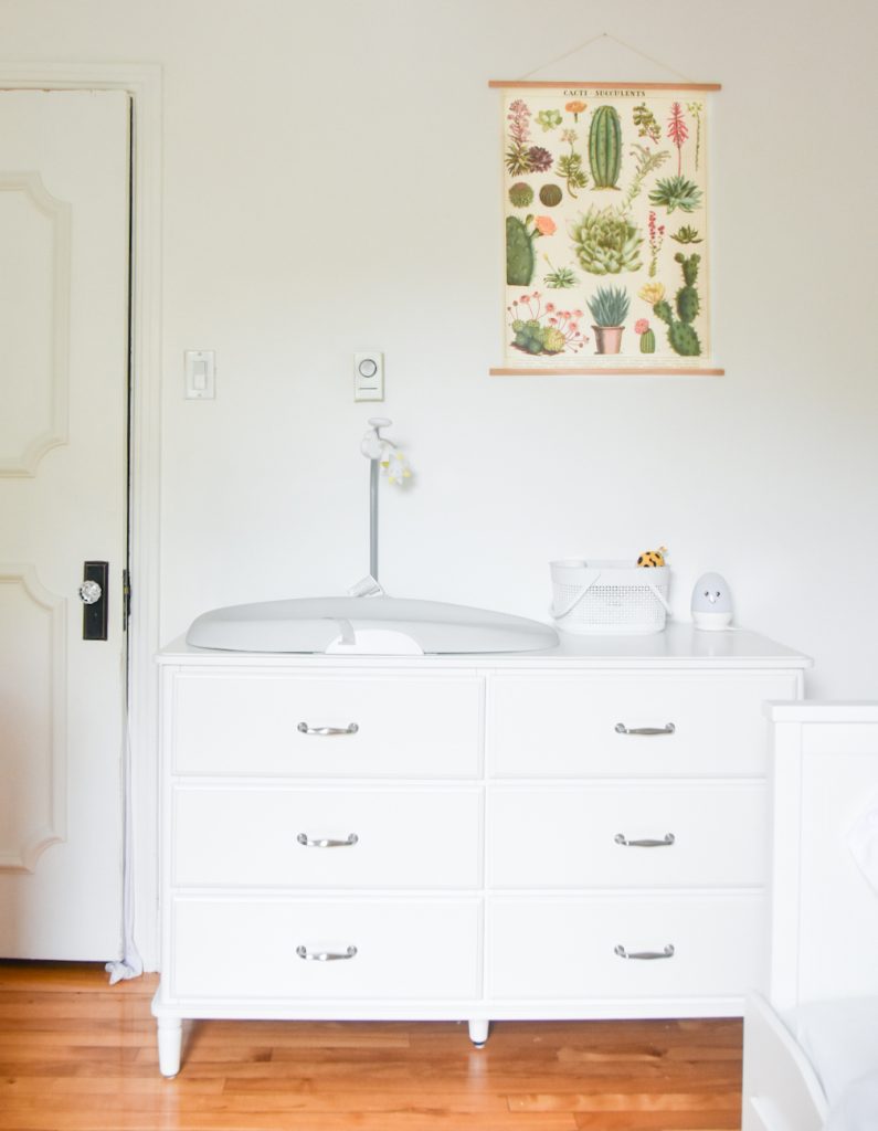
The only other new piece of furniture we got was this dresser, also from Ikea. As much as I love the storage capacity and practicality of the Hemnes, it was just gonna be too huge for this room, so we had to find a smaller option. It still fits everything we need, with a bit of room to spare in some of the drawers, as well as our Skip Hop changing pad, diapering essentials and little night light on the tabletop part.
We obviously kept Theo’s old crib and just moved it into this room (also from Ikea).
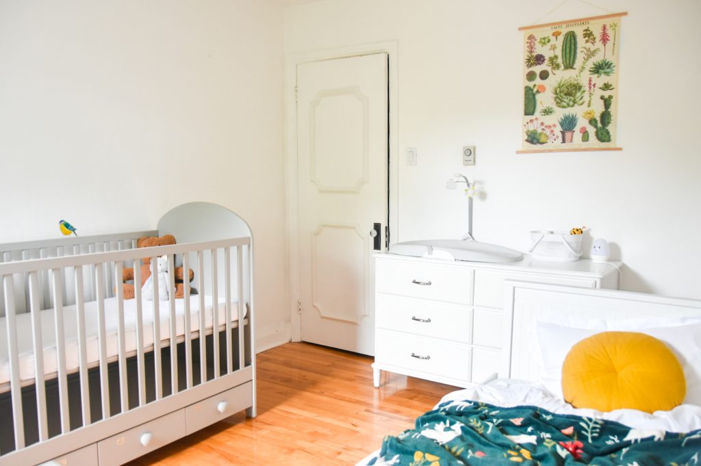
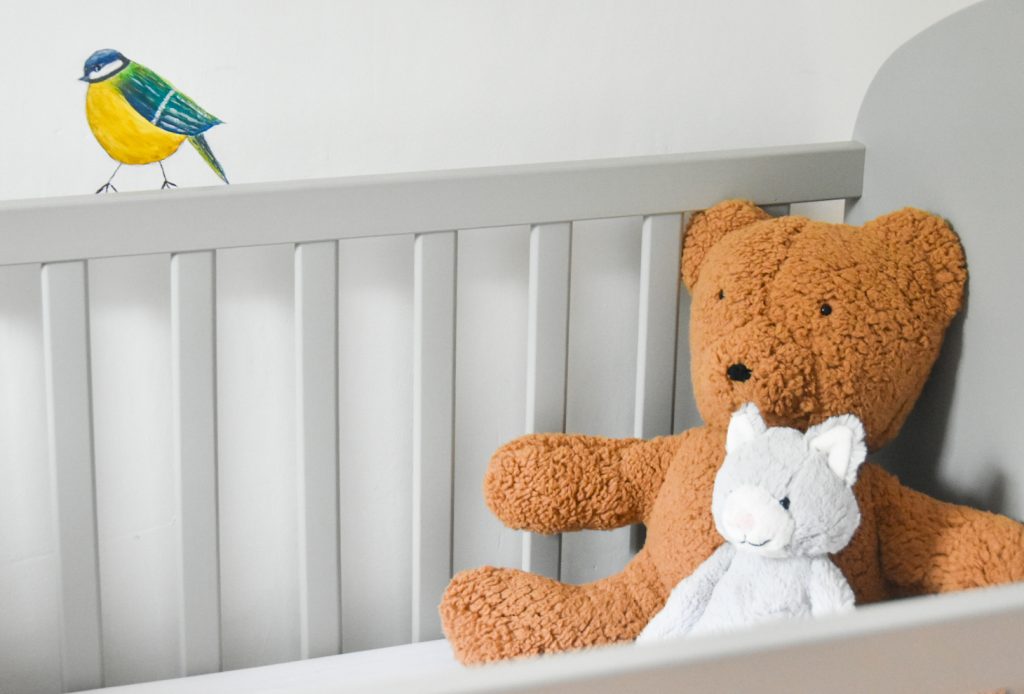
To enhance the whole whimsical woodland theme I was kind of going for, I painted a couple of toadstools right beside the crib and a cute little bird that appears perched on top of it. I think adding these little personal touches that you might not notice right away is a super fun way to add decor to a room without hanging lots of things on the wall.
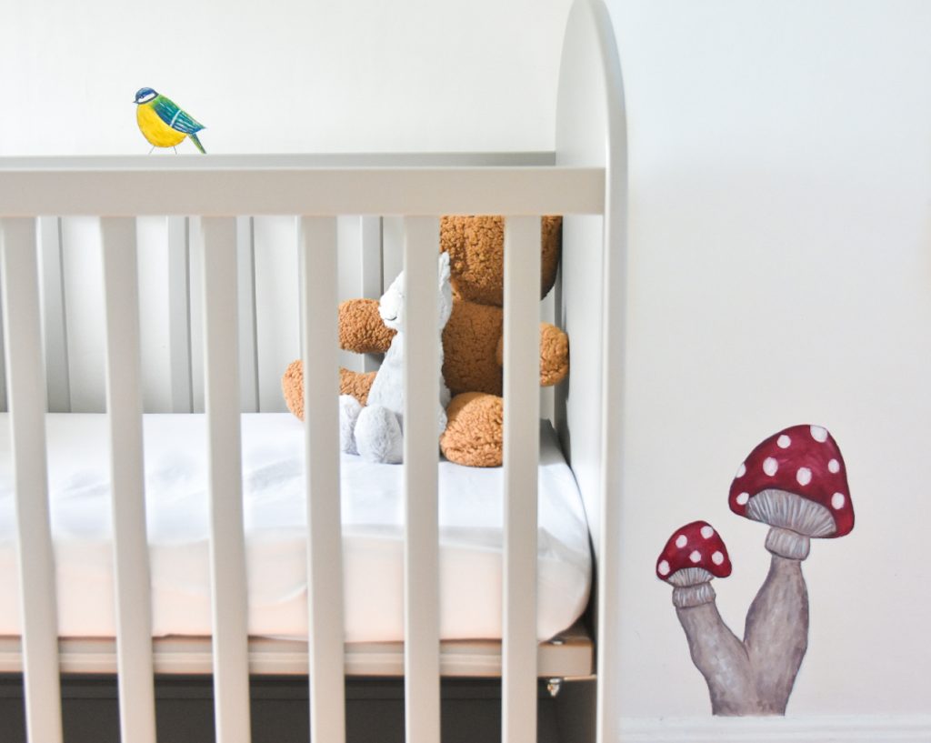
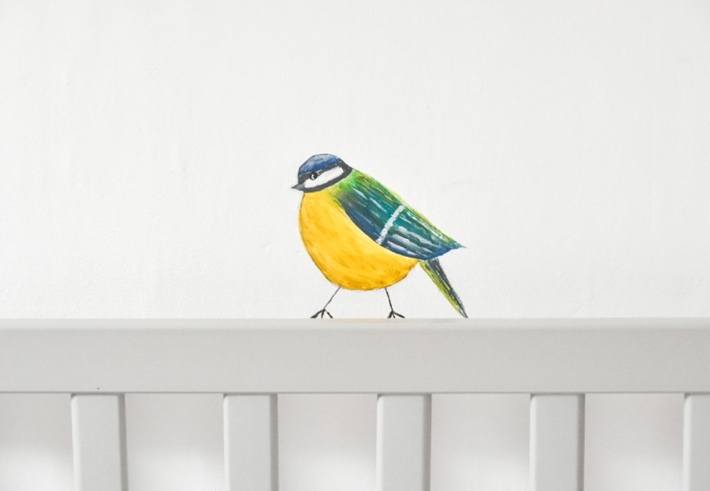
I love a fat little bird, you know, when they fluff up their feathers and look all chubby!
In case you’re wondering, I just used regular acrylic paint for all of my mural work. I don’t love acrylic paint because of how fast it dries (I prefer something that’s blendable for a while) but it’s safe, low odour, and affordable.
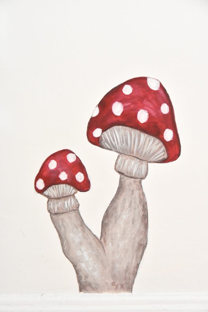
And what’s more woodland whimsical than a couple of toadstools? Theo was so cute when I showed him my paintings. He ran up to the mushrooms and squealed, “OOOOOH, MUSHROOMS!” and pretended to eat them. I guess I should tell him, if he sees these in real life, he should definitely not eat them…
My last DIY project that I just finished was this teddy bear that I made from a pattern. I ended up deviating from the pattern a little bit because I wasn’t loving how it was turning out. I’m still not loving it, but again, 38 week preggos can’t be fixating on this stuff! We gotta move on, and maybe the baby will like it anyway.
And my favourite brand of soft toy is Jellycat, so I just had to pick one up for the baby! My favourite is the Bashful Bunny, but that’s the one I got Theo, so I wanted to get something different this time (Bashful Kitty, in case you’re wondering).
It’s funny, I made an oil painting of Kyler’s childhood teddy bear, Blue Bear, like, six years ago, and used it as part of my nursery decor in Theo’s room. But he’s never said a word about it, so I assumed he didn’t care about it and I put it in the new baby’s room.
When Theo noticed, he asked why I put the Blue Bear painting in the baby’s room and I asked him if he wanted it back. Apparently he did! So I apologized for not asking about it first and put it back in his room! Go figure.
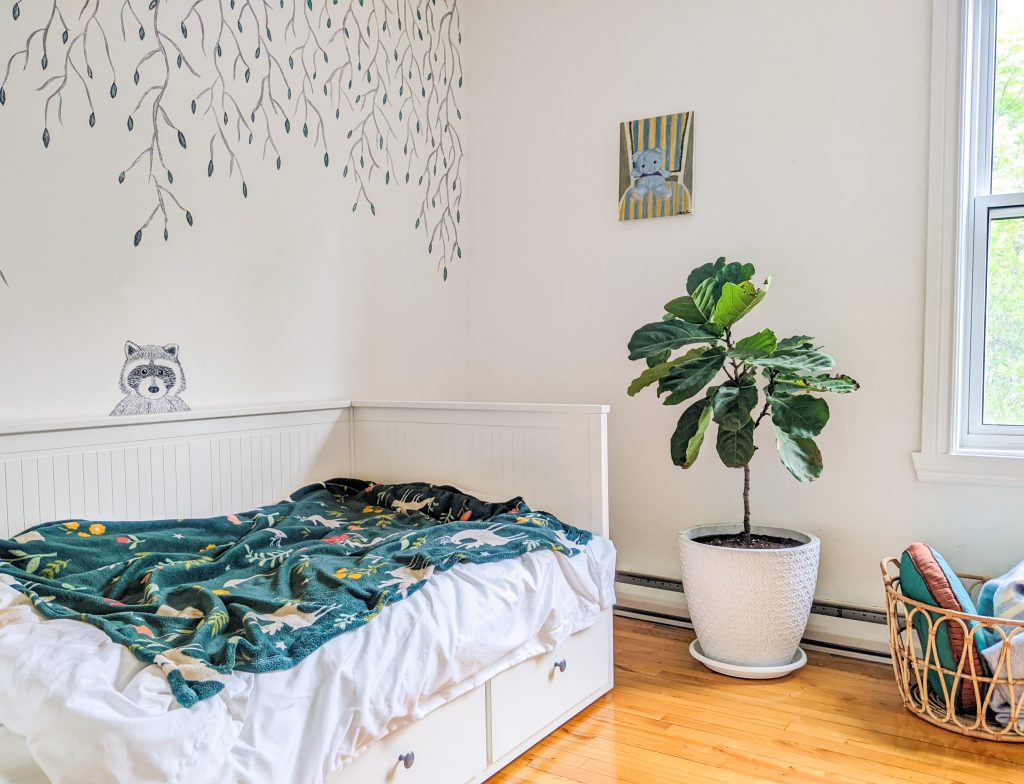
All in all, I’m really happy with how the new baby’s room turned out! Although, I did feel very limited in my design choices due to the small size of the room and the inconvenient location of the closet, window and forced air vent. I feel like a better use of the space would have been to have one of the bigger furniture pieces up against the far wall, but we couldn’t have anything big on that side of the room.
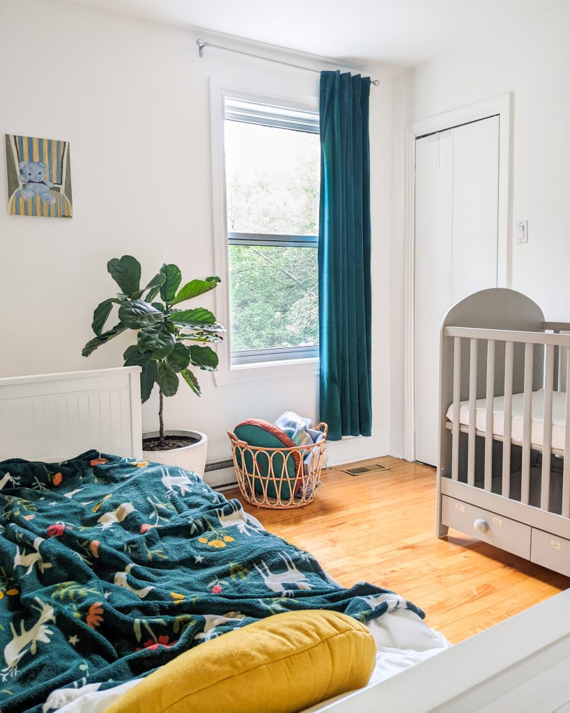
But while these limitations did steer my design towards a more minimalist approach, I still feel like I was able to add my signature pops of colour and whimsical touches. Hope you like it, baby!
Crib – IKEA
Daybed – IKEA
Throw pillow – Simons
Throw blanket – Simons
Dresser – IKEA
Changing pad – Skip Hop
Night light – sold out (this is similar)
Dresser basket – dollar store
Succulent poster – VdeV
Teddy bear – DIY
Cat toy – Jellycat
Light fixture – old
Curtain – Simons
Rattan basket – IKEA
Planter – Homesense
xoxo

