I’ve never had a guest bedroom before and it’s been put to good use since we moved in. We’ve already had four people/parties stay with us and I hope to have more in the future. My approach with furnishing and decorating it was really quite simple.

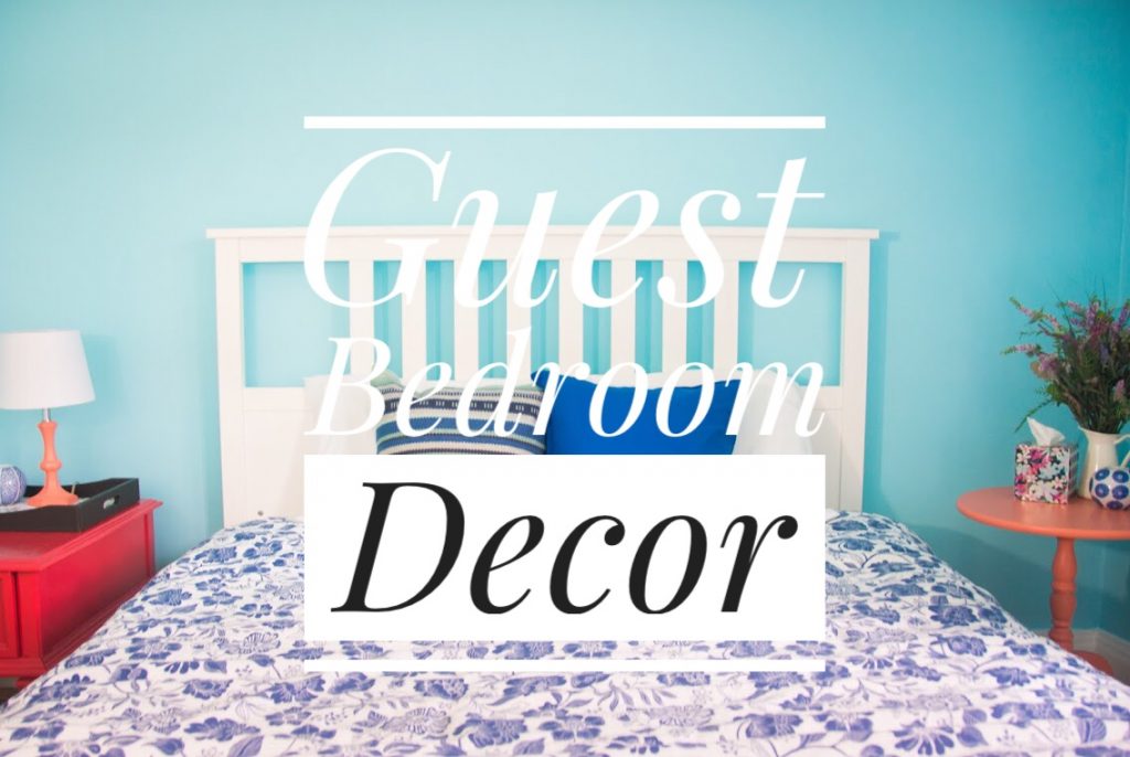
I felt it would be too cluttered if I injected too many personal effects into the design or pieces of furniture or knick-knacks. So I instead placed the emphasis on colour in the room and that became the theme around which everything centered. Painting walls a bold colour is a great way to add personality to a space without having too many things on the wall or pieces of furniture. I went with a bright baby blue, which was the starting point to my whole “blue and coral” theme. I made sure to include lots of elements of white too, which I think is the best way to add brightness to any space and balance bolder colour choices, which stops everything from looking too chaotic.

When styling the surfaces of the room, I tried to keep it simple, but visually pleasing and also practical. I like to include things I think guests appreciate (tissues, reading lamp, a nice smelling candle etc.) but also some elements of visual interest. The basic side table design rule I like to follow is include items of varying heights and finishes/colours that don’t necessarily match the table itself. I’m all about contrast!

I always have to include some throw pillows and cushions on a bed. Layering textiles is a really easy way to add just a bit more colour and coziness to any space.

This side table was a Craigslist find. I feel like I only paid like $13 for it, but I can’t remember. The previous owners had painted it a bright coral pink and added the two polka dot knobs to act as the pulls. I’ve been meaning to replace them for a real drawer pull, but I never got around to it and they’ve kind of grown on me. One thing I love to add to tables and other surfaces is a tray to corral items. It just looks more organized and satisfying to me.

The only art piece I put in the guest room is a simple print I got in Japan and I love it in the guest room specifically because I feel like the colours and feeling of the image really compliment the rest of the room design without being too on the nose. You know how I hate a matchy-matchy look!


This antique chair is one in a set of two I picked up on Craigslist for a song a while back. Extra seating is something I think is important in a bedroom and I just thought it works really well in this space. I also keep a simple throw blanket and faux wicker basket in the room, because visually, I like having things in threes that make a nice triangle, plus you never know if your guests need a bit of extra warmth at night!


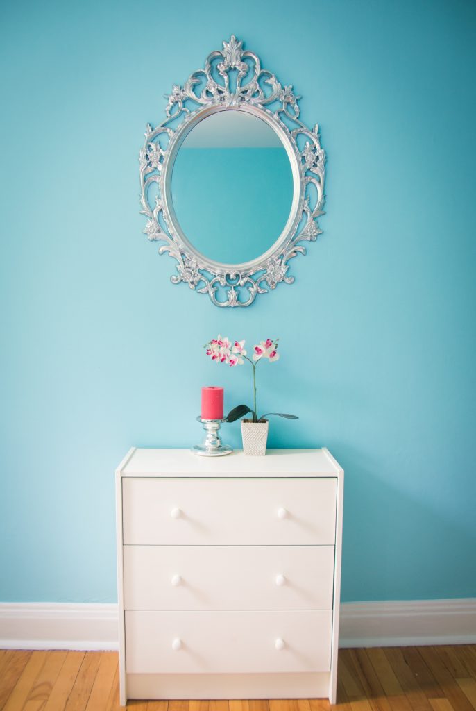
This mirror is one of the highlights of the room, in my opinion. It looks very ornate but it’s just a cheap, black IKEA mirror that I spray-painted silver. There’s no closet in this room so I included a small IKEA dresser that we had for a long time that I painted white to go with the room better. I also added a few simple knick-knacks to go on top for some colour and interest. By the way, fake plants are the best in guest rooms! You never have to take care of them and they look great forever.

Duvet Cover – IKEA (old)
Pillows – IKEA
Throw pillows – IKEA & Homesense
Side tables – Craigslist
Lamp – Bouclair Home (old, painted coral)
Blue & white candle holders – Simons (old)
Vase – IKEA
Tray – secondhand store
Rug – Wayfair
Chair – Craigslist
Basket – Canadian Tire (old)
Throw blanket – Indigo (old)
Dresser – IKEA
Silver candleholder – IKEA (old)
Orchid – Dollarama
Mirror – IKEA
Light fixture – IKEA
What do you think of the way I decorated our guest bedroom? Would you like staying in a room like this? Let me know in the comments!

